Opinion - David Bowie's Cover Versions
David Bowie is 69 today! To celebrate both birthday and albumday (as Blackstar is released) Susan Omand looks through the back catalogue, with a difference...
Ah Mr Bowie, how you’ve changed. From the fresh faced kid on the front of the first ever David Bowie album, through Ziggy Stardust, Aladdin Sane, The Thin White Duke and back to several different versions of “new” Bowie (oh, and Tin Machine) you’ve always been there, gazing lovingly, sometimes abstractly, often paintedly, out of (sometimes into) each album cover, adding an extra dimension to the music as it plays. And this time... this time there is no Bowie on the Bowie album cover. Instead there is a black star, with broken star bits looking like they should spell out his name at the bottom. What the lack of face on the cover means for the music on Blackstar I will leave for others to comment upon but it made me nostalgic for the Bowie covers of old so I’m going to gaze anew at the dilated eye gazing back through the years on his studio albums.
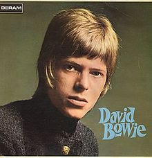
1967 David Bowie
Oh so fresh faced indeed and looking more like a school photo than something to put on an album cover.
1969 Space Oddity
This is more like it, although it does look like it’s made out of those sticky dots you get on a wall planner with a photo cut out of a magazine glued on top.
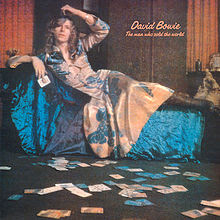
1970 The Man Who Sold the World
“I want you to paint me like one of your French girls”. The frock is gorgeous, the velvet sumptuous, the hair pre-Raphaelite curls, the middle finger intentional? What’s not to like?
1971 Hunky Dory
Oh Ms Dietrich. The silent movie influence is strong and the hand coloured fake graininess is very Edwardian.
1972 The Rise and Fall of Ziggy Stardust and the Spiders from Mars
I’ve been to this street in London – it now has a Blue Plaque commemorating Ziggy. K West is a shop sign btw, all the “quest” conspiracies are misguided. But I love the social history in this photo – the addressed boxes, the cars, the lack of satellite dishes...
1973 Aladdin Sane
I think it’s fairly safe to say this is the best known of the album covers but how many of you remember the water droplets on the face and collar bone? And why did the i in Aladdin get a dot when the i in David didn’t?
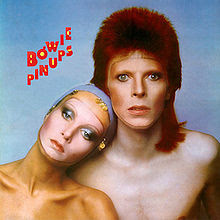
1973 Pin Ups
One of the few covers where he shares the stage. You may recognise her from the M & S ads now (yes, it’s Twiggy). If it wasn’t for the oh so seventies writing – and nice touch on the male symbology on the O – this could have been a photoshoot for a recent film. Is anyone else getting the AI feel of things like Ex Machina here?
1974 Diamond Dogs
Controversial as ever, requiring alterations to the gatefold image to suit the people that don’t get the fact that nudity in art IS art. I like that the backdrop is a painting of a painting and the fact the writing is on the floor.
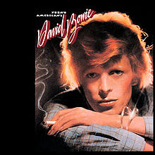
1975 Young Americans
A complete change of pace and a beautifully lit and studied portrait, jarring only with the painted in smoke.
1976 Station to Station
The Thin White Duke debut album and inspired by The Man Who Fell to Earth. The starkness of the black and white image with the red writing is so far ahead of its time, this hasn’t dated at all.
1977 Low
A still from The Man Who Fell to Earth this time and a visual pun that very few pick up on with Low Profile. Looking dated only because of the font, the fixation with orange continues here.
1977 "Heroes"
This, although it looks simplistic, is an incredibly clever cover. The blank automaton stare, the marionette pose, putting the title “Heroes” in quotes. Who’s pulling the strings here?
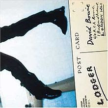
1979 Lodger
The last of the Berlin trilogy and yes that’s Bowie’s feet. The original gatefold had the full image of him sprawled on the floor of a bathroom, an accident victim in homage to Roman Polanski’s The Tenant. I love how art inspired other art!
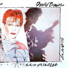
1980 Scary Monsters (And Super Creeps)
This album, or rather the video for the song Ashes to Ashes, was my introduction to Bowie. The Pierrot thing did indeed creep the hell out of me at age 11. I love the cover though, adding obvious painting to photography is still not done often enough as an art concept and it’s a lovely throw back to Aladdin Sane to use the same shade of pinks and blues. Notice too the different coloured eyes in the painting. No they’re not like that in real life.
1983 Let's Dance
Despite Ashes to Ashes, it wasn’t until this album that I bought my first Bowie record. I know it’s not cool to say it but I loved his eighties pop stuff. And this is a fun cover, using the old time dance steps as a motif for the title and writing Bowie in the same font as Lonsdale boxing used. And did you notice the echo of Aladdin Sane’s Lightning bolt?
1984 Tonight
Loving the Alien on this one with the stylised blue and the brightly bitty background. There are so many different artistic things going on too. The accepted influence is Gilbert and George but I’m seeing Tiffany lamps and stained glass moreso. A rose by any other name?
1987 Never Let Me Down
All the fun of the circus! Also the buildings from the Let’s Dance cover. But otherwise there’s a very transient feel to this cover, like he’s not staying. The suitcase, the picture of the sea, someone else waiting in the wings, the union flag covered cannon and the ladder to the sky, even the temporary nature of the circus tent itself. This is a brief but fun filled visit, although I’m still trying to make words out of the flames on the ring of fire.
1989 Tin Machine (as part of Tin Machine)
Yes I’m adding in the Tin Machine covers. The first album cover was cleverly done as the band members were in different positions depending on which format of album you bought, pointing to the democractic nature that we knew Tin Machine had, this wasn’t David Bowie’s band, it was Bowie IN a band.
1991 Tin Machine II (as part of Tin Machine)
The second Tin Machine cover didn’t feature Bowie, (or did it? We’ve all seen Labyrinth... nuff said) and yes, America, we got all the bits and places that your censors decided to airbrush out.
1993 Black Tie White Noise
A return to solo work echoed by the stripped back nature of this close up portrait. And yet... the upside down, cropped writing hints that it’s not all as straight forward as all that.
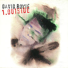
1995 Outside
The art of the artist here as this is Bowie’s own painting. I love the washed out colours and the sharpness of the eyes in contrast to the blur of everything else. It almost feels scientific, like cultures growing on blotting paper with the blotches and swipes, which makes the use of an industrial stamp like title very apt.
1997 Earthling
This is my “What the Hell was he Thinking!” cover out of all of them. Yes I know the coat is by Alexander McQueen and he was probably going for England’s “green and pleasant land” but the colour contrast of him clashes (not in a good way) with the far too bright landscape and the choice of title font makes it read like Fart hling.
1999 'Hours...'
There is such a lot to love about this cover (and yes I have the 3D limited edition one too). From the barcode lettering to the Scary Monsters collar to the echo of the lightning again, this is a subtle homage to all that has gone before, almost a last rites as white is the oriental colour of death.
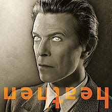
2002 Heathen
I don’t know quite what to make of this cover. Unlike “Heroes” where a simple portrait design conveyed so much, this one is trying too hard to be clever and designer-y and overdoes things. It’s almost like it’s a “Steven Moffat does Bowie” cover! Seeing the light, the dark satanic edges, the upside down cross of the T, the use of the Priori font. Just all too clever with the religious/anti-religious symbolism. It just needs horns and a tail!
2003 Reality
Obviously arty and a wonderful Manga interpretation of the main man. With the mix of media, of fluid and linear shapes, order and chaos, the recognisable and the inferred, it's a challenge to our perception of reality.
2013 The Next Day
Unlike Heathen, this is “clever” that works. A decade on from his last album, this sends such a strong message, reworking the original “Heroes” cover to such an extent as to deliberately remove all the symbolism from it. More than that though, it almost has a punk graffiti feel to it, a disrespect for the past in striking through the title rather than removing it, a sense of time moving on, like covering up old bill posters outside a venue with this week’s band.
2016 Blackstar
And so we come to the latest cover. Artistically what to make of it? In the context of the complex and rich jazz nature of the music I’ve heard so far? The simplicity of structure and monochromatic colour scheme is a stark counterpoint which works and the shapes at the bottom are a cipher waiting to be decoded. Out of context? It’s egotistical pretension that has been done before, and better, by the likes of Prince. I hope the rest of the album isn’t like that.
Images - Bowie website and Wikipedia












Post a Comment