Review - Art of Scandinavia: Democratic by Design
What does Susan Omand know about Sweden? SAAB engines, ABBA, Bjorn Borg, the chef from the Muppets and IKEA. Only one of these gets a mention in this final instalment of Art of Scandinavia...
The programme this time starts at 1628 (the year, not half past four) when The Vasa, the most advanced warship of its time with twin gundecks, set sail from Stockholm harbour intent on world domination. Fourteen hundred yards away from the dockside... it sank. It was not salvaged until 1961 and installed in its own museum in a move that reminded me so much of the Mary Rose salvage that I watched with bated breath every week on Blue Peter back in the day. The Vasa, though, was a very impressive vessel with an incredibly high centre of gravity which, no doubt, led to its sinking. The stern is huge, imposing and highly ornamented, unlike the Swedish designs of today. It looked like a very ornate and very over-sized sideboard to be honest, such is the high-relief carving in the wood.
Having established this monument to failure, it did sink after all, as the centrepiece of Swedish art, Andrew Graham-Dixon fast forwards to the early 20th century to pick up the story of the country’s art again and the work of “the Red Prince,” Prince Eugen, so called because of his socialist upbringing even though he was royalty. While his life drawing is interesting it annoyed me that the subject of his sexuality was of more interest to the presenter, using the argument that Eugen painted more naked men than naked women, seemingly forgetting his own statement from a previous programme that it was in fact illegal for women to pose naked for male painters until relatively recently. And anyway, what the heck does the sexuality of a painter, or anyone for that matter, have to do with the quality and artistry of their work? It’s surely the talent for the task at hand that matters, not sexuality, gender or race. (OK, mini rant over).
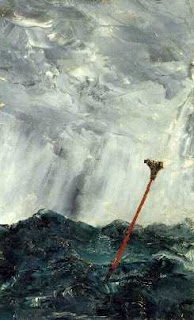
The Prince was also a patron of the arts and a collector of works to display the range of artists available at the time. Anders Zorn was one and a keen proponent of naturism, with many of his paintings featured in the programme being naked women frolicking in the open air. Going back to the Prince’s own work, we see his landscape work, which is absolutely beautiful. There is a sense of surrealism in his landscapes and forests, not in the overt sense of Dali, but there’s a sense of the not quite natural to his natural landscapes which is both unsettling and exciting. This sense of uncertainty affected many other artists at the time, including Richard Bergh, whose use of light and subject gives his art a sense of foreboding and eeriness. Wonderful stuff. One of Bergh’s more famous portraits is that of the playwright August Strindberg and it is he who is the subject of the next section of the programme as Dixon-Wright looks at the changes Strindberg made to theatre in Sweden, making his plays feel more participatory and dreamlike rather than linear and observational for the audience. Strindberg was also a painter, drawn to the ocean as a subject and his works, painted using a minimal colour palette and a knife rather than a brush, are as striking and turbulent as his life.
Post First World War art in Sweden is different to that of other European countries and Graham-Dixon attributes this to Sweden’s non-participation in any of the wars of the 20th century. Gösta Adrian-Nilsson (GAN) is one of the notable modernist names of this postwar era, creating cubist dioramas and sculptures that really do echo the more familiar work of Picasso et al but in a 3D format. His paintings too are very futuristic with bright colours, sharp lines and abstract shapes. However, Graham-Dixon also points out that a lot of these postwar pictures have been dug out of the store for him to look at, rather than being on display in the galleries themselves. Telling perhaps that they don’t find as much favour as the modernist paintings of other European countries. Which is a shame really.
However Sweden excelled in other modernist areas, namely architecture and design where the simple pared down, almost deco, designs shunned all opulence and frippery. The Stockholm exhibition of 1930 showed off these new “functionalist” designs that are so familiar in the shapes and styles of Ikea. The Functionalists believed that if the consumer could be re-educated to shun objects of desire, luxury and non-necessity and only buy that which they needed, the world would be a better place. So much for that idea then. Government housing too, came under functional design, with simple basic clean lines and enough, but not plenty, for all. By the sounds of it, this is as close as a style of communism came to actually working in practise as class differences were minimised. From here it is only a small step to the one-man world-dominating design palace of IKEA and modernism for the masses.
A jump now to the ink and watercolours of Karl Larsson whose paintings look like they could have come out of a children’s story books such is the simple furniture, the primary colours and homely feel. As Graham-Dixon says in the programme, they have “a strange ability to make you feel nostalgic for a world that you never knew.” The paintings, and that feeling of nostalgia and hankering after a simpler life, became so popular that people started to try to recreate the looks from the paintings in their own homes, and that is where IKEA came to the fore who supplied that demand.
From furniture to architecture for the final piece in the Swedish flatpack of social democracy and functionalism and a look at the minimalism of the Landskrona Sports Hall designed by Arne Jacobsen, ironically a Dane who used Norwegian marble in its construction. However, it was the novelists who started to highlight the cracks in the perfect world that Sweden portrayed. They did this by writing about the “seedy underbelly” of Swedish society in detective novels in the forerunners of the Nordic noir that we know today. The downfall of social democracy was to soon follow
Coming bang up to date in both art and politics, the disaffection of a sidelined population is reflected in the black graffiti art of NUG and the highly disturbing psychological performance art of Anna Odell. There is no colour here. No joy. Only blackness. Anger. Violence. Pain. It’s a far cry from the colourful landscapes of only a few decades earlier.
I’m going to stick my neck out here and say that calling the series Art of Scandinavia is maybe a bit of a misnomer. Looking at all three programmes together, not only did we get an insight into the culture of each different country featured, we got an insight into the history, politics and social anthropology of each place. Yes there was art in each episode, and yes I discovered work that I hadn’t known about each time but only in the first programme on Norway did I feel that the actual art was central to the show, for the other two it seemed to be more of a by-product or a relational thread from which to hang all the rest of the information. Would it work as a format to look at other countries’ art? I don’t think so because Scandinavia has managed to remain uniquely insular compared to the more cosmopolitan nature of other countries in Europe and beyond. However it was still a very interesting series and one that I think would bear a rewatch now that I know what to expect.
Images - BBC and Wikipedia


Post a Comment