PotD - Camille Pissarro
In an occasional series for this year, Susan Omand hits the Take a Chance button on London's National Gallery website and writes about what she sees...
What’s the painting called, who is the artist and when was it painted?
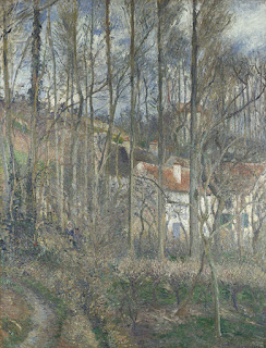
The Côte des Bœufs at L'Hermitage by Camille Pissarro, painted in 1877.
What does The National Gallery say about it?
This wooded hillside, called the Côte des Bœufs, was close to Pissarro’s home in the hamlet of L’Hermitage, near the market town of Pontoise, where he lived for most of the time between 1866 and 1883.
Although Pissarro was a leading Impressionist, this painting signals his move away from the fleeting atmospheric effects of Impressionism. Instead, he is primarily focused here on the structure of the composition, which he has carefully arranged using counterbalanced vertical and horizontal lines. The thickly applied paint and densely worked surface, which he built up with multiple small brushstrokes, is also quite distinct from the swift fluid brushwork and sketch-like qualities of Impressionism.
This shift to a more structured version of Impressionism foreshadows the concerns of the next generation of Post-Impressionist artists, particularly Cézanne and Seurat.
A larger/clearer look at the painting [details brightened using Photoshop]
A larger/clearer look at the painting [details brightened using Photoshop]
What’s interesting about the painting?
Brightening the colours, above, throws the composition into much sharper relief; this reveals that it's not nearly as impressionistic an image as, say, Monet because, without the pastel colours, this loses the dreamlike multi-sensory feel that I associate with most Impressionists. Instead it becomes a "normal" recognisable landscape of a group of buildings in trees on a hillside which, although technically well executed, for me, doesn't subscribe to the Impressionistic school in the same way, even taking into account what the National Gallery note above on its part in the evolution of the form to post-impressionism.
What do I personally like about the painting?
I like the strong verticals of the tree trunks and how they cut across the sinuous curvature of the hillside. There's also an incongruous spot of red at the base of the tree on the left that really intrigues me.
What do I personally not like about the painting?
I'm not a fan of the pastel colour palette - I would have loved to see this as a black and white woodblock print or something to bring out the composition and shapes. I don't see the point of the people being in there either - it would have worked just as well as a landscape without them in my mind.
Would I have it on my wall?
At first glance, I was drawn to it and thought I would but, having spent time looking at it, it's all just a bit too insipid for me I think.
Image - The National Gallery This image is licensed for non-commercial use under a Creative Commons agreement.


Post a Comment